Colour is the unsung hero of architectural design, capable of transforming cold concrete into warm community spaces and sterile environments into dynamic workplaces. Aluminum Composite Material (ACM) panels offer an extraordinary canvas to paint emotional landscapes through strategic colour selection. Here are some key insights:
- ACM (Aluminum Composite Material) panels are more than just structural elements; they’re powerful communication tools
- Between 62% to 90% of initial consumer judgments are based on colour alone
- Colours can transform spaces from sterile environments to vibrant, engaging experiences
When architects and designers understand the psychological power of colour, they can craft spaces that do more than just shelter—they can inspire, calm, energize, and connect people with their environments.
[/vc_column_text]Every project has different priorities. To discuss how ACM can benefit your unique project, call our office, at no obligation.
Colour Theory Fundamentals in Architectural Design
Colour psychology isn’t a modern invention but a time-honored practice dating back to ancient civilizations. From Egyptian blue symbolizing protection to Gothic cathedral reds inspiring religious awe, colours have always communicated deeper meanings beyond mere aesthetics. Here are some key insights:
- Colours trigger specific psychological and physiological responses
- Warm colours (reds, oranges) generate excitement and energy
- Cool colours (blues, greens) promote calmness and focus
- Historical precedents show colour’s cultural and emotional significance
Modern designers can leverage these historical insights, using colour strategically to enhance mood, productivity, and human interaction within architectural settings. That’s why giants like McDonald and Hyundai place a special emphasis on exterior design.

Colour Palette Categories for ACM Panels
Warm ACM Colours: Energizing Spaces
Igniting Emotion Through Vibrant Hues
- Reds, oranges, and yellows create inviting, dynamic environments
- Warm colours stimulate social interaction and creativity
- Strategic use can transform corporate spaces into collaborative hubs
Warm colours are psychological powerhouses. A carefully selected orange or coral ACM panel can turn a corporate office into a creative sanctuary, while golden tones can make retail spaces feel more welcoming and engaging.

Cool Colours: Cultivating Serenity
Crafting Calm Through Sophisticated Shades
- Blues, greens, and purples evoke tranquility and focus
- Ideal for healthcare, educational, and wellness environments
- Soft hues can enhance productivity and emotional well-being
Cool colours are the architects of calm. A serene aqua blue ACM facade can transform a spa into a healing sanctuary, while soft greens in an educational setting can promote balance and renewal.

Neutral Shades: The Design Chameleons
Balancing and Elevating Architectural Narratives
- Grays, whites, and beiges provide visual harmony
- Act as sophisticated backdrops for bold design elements
- Enhance brand identity without overwhelming sensory experiences
Neutral tones are the unsung heroes of design, providing balance and allowing more vibrant elements to shine. A well-chosen neutral ACM panel can create a canvas that speaks volumes through subtlety.
Every project has different priorities. To discuss how ACM can benefit your unique project, call our office, at no obligation.
Accent Colours: Strategic Visual Storytelling
Guiding Perception Through Calculated Contrast
- Strategically placed accent colours draw attention to key architectural features
- Create visual interest and emotional engagement
- Work best when harmoniously integrated with primary colour schemes
Accent colours are like punctuation in architectural language—they emphasize, guide, and create memorable visual experiences.
Technical Considerations
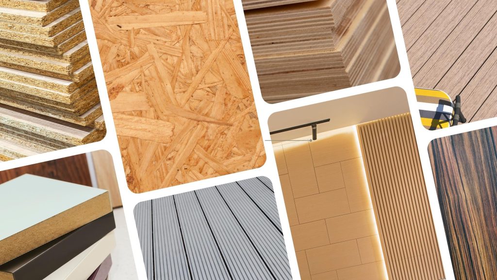
Finishes and Textures of ACMs: Beyond Colour
Elevating Design Through Surface Treatment
Aluminum panels, compared to other construction materials, have numerous advantages including variety in colours and finishes. The surface treatment of ACM panels can transform colour from a simple visual element to a complex, interactive design feature. Here are some key Insights:
- Finishes dramatically influence colour perception
- Options range from high-gloss to matte, wood-like to metallic
- Each texture tells a different design story
Finishes in ACM panels are far more than mere surface treatments—they’re strategic design languages that architects can leverage to:
- Solid Colours: Establish strong visual identities through consistent, intentional tones
- Bright reds for attention
- Deep navy for sophistication
- Create foundational emotional landscapes
- Matte Finishes: Embrace Subtle Sophistication
- Non-reflective surfaces that soften colour
- Perfect for professional commercial spaces
- Masterfully play with light and shadow
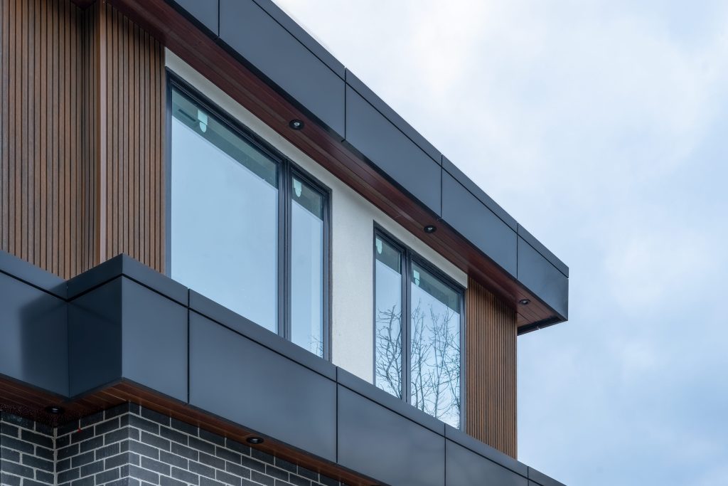
- Natural Textures: Biophilic Design Approach
- Wood-like finishes that inject warmth
- Bridge contemporary aesthetics with natural comfort
- Ideal for urban developments seeking serenity
- Advanced Finishes: Pushing Design Boundaries
- Metallic surfaces that capture and reflect light
- Mica finishes with dynamic colour-shifting properties
- Specialty coatings like anodized and prismatic options
The right finish transforms ACM panels from mere building materials into powerful design storytellers, capable of evoking emotions, guiding perceptions, and creating memorable architectural experiences.
Wiedehopf as one of the well-known Alpolic product suppliers provides a variety of colours and finishes that can be used to reflect a special brand identity and values.

Cultural and Environmental Factors
Colours are laden with meanings shaped by historical, social, and environmental factors unique to each region. For example, while white is often associated with purity and weddings in Western cultures, it can symbolize mourning in some Eastern traditions. Let’s take another example; In Toronto’s vibrant architectural landscape, ACM panels serve as more than just building materials—they’re canvases of cultural dialogue. The city’s multicultural fabric demands a nuanced approach to colour selection, where every shade tells a story of heritage, integration, and shared identity.
Consider the symbolic power of colours across Canada’s diverse communities:
- For Chinese-Canadian neighborhoods, red symbolizes prosperity and good fortune
- In South Asian communities, saffron and deep orange represent spiritual significance
- European-influenced designs might lean towards cool, understated tones
- Indigenous-inspired architectural elements often incorporate earth tones and natural palettes
Practical Selection Guide
Navigating Colour Choices with Confidence
Selecting the right ACM panel colours involves more than just personal preference; it requires a thoughtful assessment of project goals, installation process and the desired atmosphere of the space. Start by defining what emotions or experiences you want to evoke in the environment. For instance, a corporate office aiming for professionalism may benefit from popular ACM panel colours like black and white, which communicate sophistication and clarity. In contrast, a creative hub could leverage vibrant cool colours—like teal or lavender—to stimulate innovation and energy among employees. Therefore:
- Use digital tools like colour wheels and study recent ACM trends
- Collaborate closely with others involved
- Consider emotional and functional goals
- Experiment boldly while maintaining design integrity
Selecting ACM panel colours is an art form that balances psychological insight, technical knowledge, and creative intuition. Wiedehopf as one of the leading ACM panel suppliers is ready to provide you with consultations needed for choosing the best ACM colours and finishes.
Every project has different priorities. To discuss how ACM can benefit your unique project, call our office, at no obligation.
Conclusion: The Transformative Power of Colour
Colour is not just a design choice—it’s a strategic tool for creating meaningful architectural experiences. By understanding colour psychology, technical considerations, and cultural nuances, architects and designers can transform spaces from mere structures into living, breathing environments that inspire, comfort, and connect.
Embrace colour confidently. Let your ACM panels tell a story, evoke emotions, and create lasting impressions.
Ready for telling a story?
Are you prepared to transform your next project with the power of colourful Aluminum Composite Panels?
ACM Panel Colours FAQs
- Neutral tones: White, gray, beige
- Cool colors: Blues, greens
- Warm colors: Terracotta, orange, warm reds
- Metallic finishes are increasingly trendy
Lighter colors:
- reflect more sunlight, reducing heat absorption
- Can lower cooling costs in warmer climates
- Contribute to sustainable building design strategies
High-quality ACM panels can maintain color integrity for 15-20 years. Factors affecting longevity:
- Quality of paint/finish
- Exposure to sunlight
- Local climate conditions
- Maintenance practices
- Low-VOC (Volatile Organic Compounds) paint options
- Pigments with lower environmental impact
- Recyclable and eco-friendly material choices
- Energy-efficient color selections
Prices vary based on:
-
- Color complexity
- Finish type
- Manufacturing process
- Quantity ordered • Custom colors typically cost 10-30% more than standard options
- Multiple finish options: Gloss, matte, metallic, wood-like
- Custom color matching available
- Textures can be tailored to specific design requirements
- Advanced techniques like mica and prismatic coatings
- Define project goals and desired emotional response
- Consider environmental factors
- Use color psychology principles
- Utilize digital color tools
- Consult with design professionals
- Request physical color samples
ACM panels are designed to withstand various environmental conditions. They are resistant to:
-
- UV radiation
- Temperature fluctuations
- Moisture
Performance varies by specific panel composition
- Regular cleaning with mild detergents
- Avoid abrasive cleaning materials
- Inspect for damage or color fading periodically
- Professional cleaning recommended for large installations